Get out of the way
So Google recently launched keep, basically an Evernote competitor with some nice looking features like check-lists inside. As I had to do some larger groceries shopping for an extensive Thai-Food-Meal anyways, I decided to give it a spin. And after typing in the list of 50+ items into my phone - which takes way to long and I won’t repeat again, I went out to get those groceries. Boy, never again. As so many other todo-list apps and project managers, also Google Keep fails on one major aspect: getting out of the way.
There seems to be this tendency among todo list and project management tools to look more pretty than one another. Maybe it is related to the fact that the developers have to look at it every day and simply don’t want to look at something ugly. But also in this case I am again pretty sure, they have not been actually used by the developers. Or at least not in a real-life scenario like buying stuff on a list (which isn’t that uncommon), because then they’d have realised that making it look pretty, with a flat ui that displays also deleted items to beautifully and nicely draggable items is not actually what counts. Let me show you the screenshot I made when I was really pissed off it:
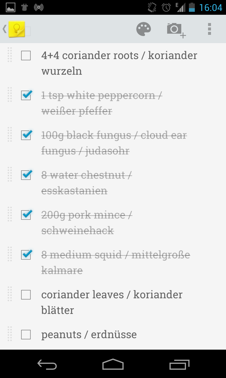
What you see here is a 10th of my todo list for that day. Yes it looks pretty, also the items crossed off look very nice. But why? Why do I have a long list of crossed off items in the first place? What is the point? No one thought about that obviously, because otherwise they’d realise that it totally going against any use case. The more things I crossed off the harder it got to find those I should take care of now because all this clutter was in the way. And that is what many todo-list apps and project management tools get totally wrong: they focus on the organising and management part. But everyone, who’s ever read GTD knows inside out: when you are on the task, you should not be doing any task management but instead just push it into the inbox and do that later. Managing the todo list is its own task but not something to do on-the-go.
And missing that point, they try to merge management somehow into the execution and fail horribly. Like in this case. Having the management looks and work pretty might be something the project manager and the developer want to have, because they stare on it all day every day, but the majority of time spent with these tools is at execution when the focus is on getting stuff done and the job of tool is to get out of the way. But they don’t. They clutter the UI and make you lose focus by inviting you to manage the tasks instead of getting them done. Using those tools you just waste time, better go for the not-so-pretty instead.